Jess and Cori Answering Listener Questions
This week, we’re answering some of YOUR questions! We love knowing what YOU want to know from us.
Q: Can you elaborate on the art of effing it up a bit or how to give a room that slap in the face? For a safe decorator that wants to interject something bold, how do you select something that you won’t tire of when the shock value presumably wears off? How can you separate your home from the look that everyone else has?
Where do you begin when you have a good foundation and you want to throw in a curve ball and achieve something unique?
First of all, let’s provide some context to the art of ‘effing it up a bit’. Back in about 2008, Rachel Zoe had this entertaining celebrity stylist show. Her assistant, Brad Goreski was so much fun and eventually got a show of his own (It’s a Brad Brad World). Brad was dressing Cameron Diaz and she had on this perfect white outfit. Brad said, it’s good, but I want to “eff it up a bit with some coral!” We always come back to that. When something is too perfect, you need to slap it in the face a little bit.
In design, safety is doing the same thing that your neighbors all do, but there is something so rewarding in having a home that’s very unique to you. The more you try to have your home look the same, the more comparison comes into play.
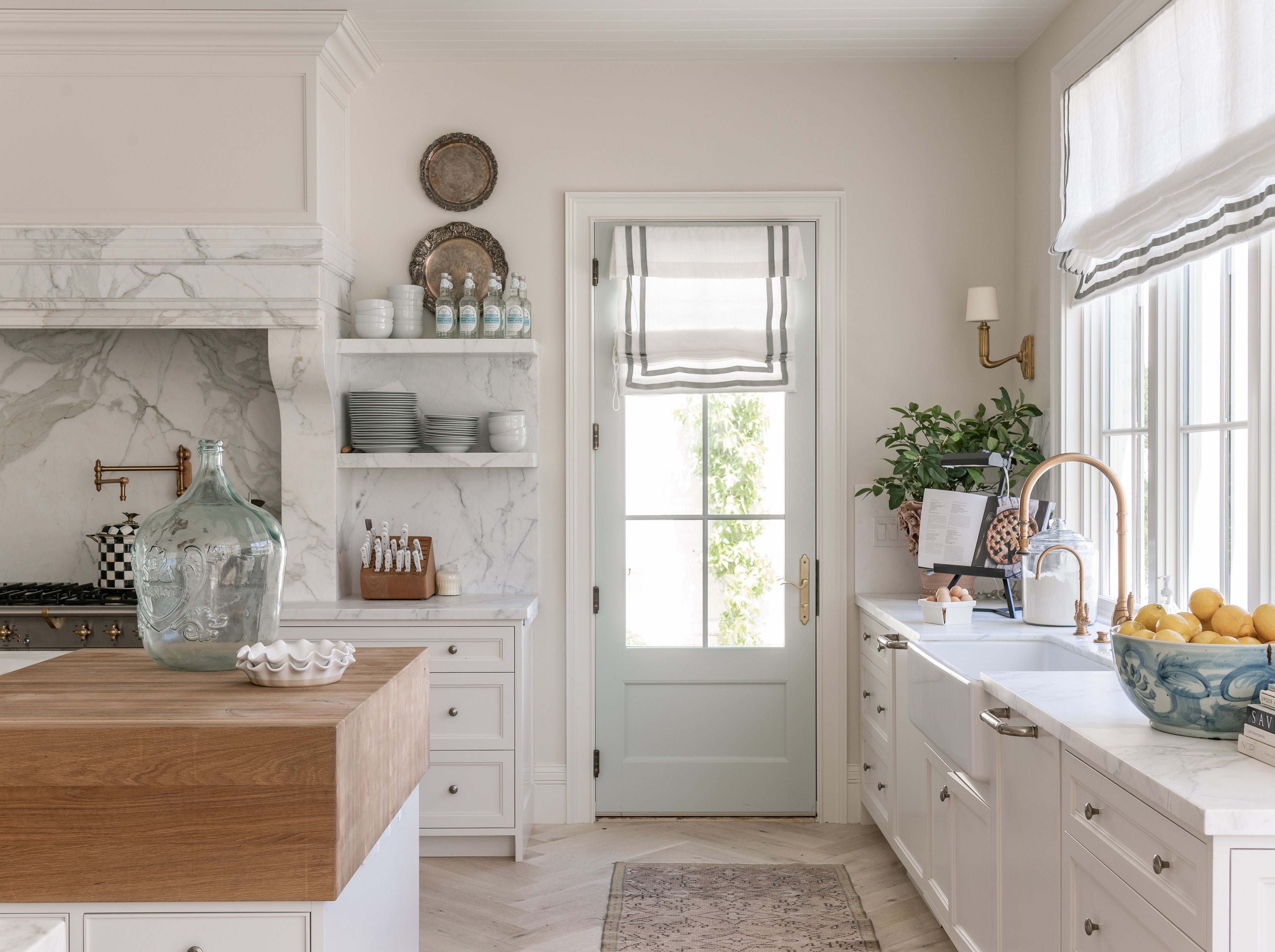
One way you can really achieve your own look is with COLOR. Wall color is the most cost-effective and impactful way to get there. There’s been this trend with the farmhouse look where everyone has these spaces with white walls, white trim, and blonde floors. It can be beautiful, but it doesn’t stand out.
Start by selecting a beautiful, massive rug. And then throw the paint deck at it and select a color to change the temperature of your room. You could even take it up a level by wallpapering.
If painting a room is a little out of the question, start smaller. A simple swap of the throw pillows on your sofa will start to get you closer to your goal. One that’s all your own.
Some people really struggle with that first step. So, here’s some advice - go back to what you like. What feels good to you? Stare at your favorite rooms you have saved on Instagram and Pinterest and try to find the common denominators. How do you emotionally react to these images? Start there.
Q: How would you suggest displaying family photos?
About 10-15 years ago, we were in an era where people would get these huge studio-set family photos and decorate around them. Family photos have their place, but they are really for creating a moment or a memory for you and your loved ones.
We love using photos in your intimate spaces - with proportionate scale and great frames. Jess says, “My mom has a hallway going back to her bedroom with family photos taking up every space - from the floorboards to the ceiling. It’s a frozen time capsule. It’s a beautiful gallery wall that we spend time in and revisit the memories.” Gallery walls are a perfect way to display such a collection of memories.
The ‘family room’ is where the family spends time together, so we usually include family photos there. But it doesn’t need to be a massive print above the mantle. Ralph Lauren does a great job of including family photos in beautiful frames with details and different sizing. The photos live on a large side table or on open shelving and feel really purposeful. You’re basically creating your own moment with photos.
One of our favorite examples is a project we designed for a family. Each of the children’s rooms had a vestibule as they entered the space. We wallpapered the vestibule and then littered the wall with photos of them - their dance recitals, art projects, special memories. It was very impactful and made each child feel so special.
Q: How do I achieve a luxe look for less?
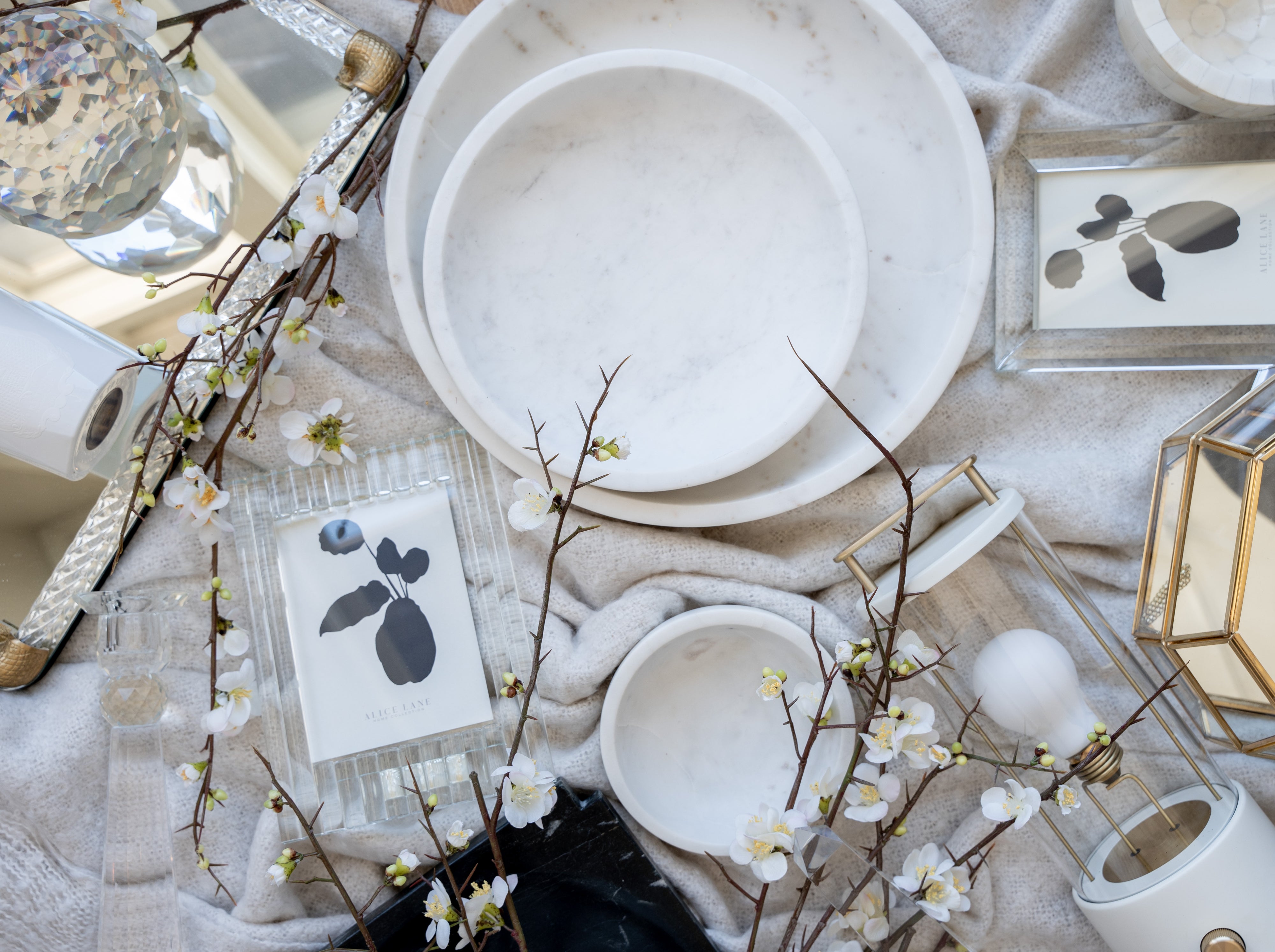
We all want to know how to do this! Luxe is something we’ve learned from watching the greats. If you’ve ever visited Ralph Lauren’s showroom, you’re immediately taken back by the scale. Scale makes everything feel more luxurious. Massive rugs, larger lamps, and tables that are over-the-top. These larger items can be found anywhere when you look - whether you love vintage shopping or hitting Home Goods, pay attention to scale.
A few details on scale:
- Throw pillows - start large and graduate to smaller as you move forward. We love a good 24” or 26” pillow in the back and then go 2 inches smaller in the front.
- Older homes and older furniture is tricky because everything was just smaller back then! This is where we love to repurpose pieces in a new way. We’ll use a dining table as an entry table. Or a secretary desk as a nightstand. This also positions you to be able to say, “Sorry, it’s vintage,” whenever you are asked about it!
Q: How do you find affordable chandeliers when you can’t afford that Kelly Wearstler look?
We hear you! We all want that Kelly Wearstler look!
Here are a few of our secret sources :
- Hudson Lighting - Retail prices are about 30% less than visual comfort and the quality is still there. Admittedly, there are a few design details left off, but lighting at Hudson is a big bang for your buck!
- Visual Comfort’s retail brand is Circa Lighting. Some of these pieces are made with different materials, but the pieces are still stunning. Both Kate Spade and Kelly Wearstler have lines through Circa Lighting.
- Vintage - As always, going vintage is a good way to find interesting pieces. And some of the vintage light fixtures are so fun to incorporate and reimagine.
- Regina Andrew - This is kind of hit-or-miss, but she does a great job with knock offs and staple pieces.
Q: How do I make my own design board for a build?
Pinterest usually ends up being our starting place. The key is to keep everything organized. We make one board and then add folders for each room - dining, primary bedroom, etc.
Then start your searching. Use keywords that you already know you are into and go from there. When you find images that speak to you, pin them to the appropriate folder. You can add notes or label the pins according to what you like most about them (e.g. staircase, lighting). This organization makes it a lot easier for you to make notes or even share your boards with your designer/architect without it being completely overwhelming.
Allow yourself to dream. Stay on the beautiful images and scroll down to show similar images and go down that pinning rabbit hole. When you feel lost, go back to the original board and folders. This is your north star so that you can give better direction or make decisions. Sometimes when you see too much and make too many decisions, you start to get confused. Go back to that north star.
Q: Is backsplash out? Is it all about the slab now?
With everything in design, it really depends on what look you’re going for. We’re working on a home right now with a woman from England who is doing a really gorgeous tile in her kitchen because she wants more of an artisanal look as opposed to modern. Backsplashes allow you to add color. They are more eclectic and customizable.
In general, about 97% of the homes we’re doing now are quartzite or marble slabs. If you can afford it, go for it! It looks more high-end because it is!
If you can’t do a full slab, or maybe you have some leftover, use this piece above the range and then do tile around it. The range is your money shot. AND…when bacon grease hits the slab, you won’t have to worry about cleaning all that grout.
If you’re using a manmade material, don’t do the slab. The veining just looks off and it doesn’t have the same impact.
Whatever material you use, our advice is to go for it. Take it all the way to the ceiling!
Q: In a new build, which direction should we have our home face to capture the best natural light?
It’s all about natural light! Windows are bigger than they’ve ever been.
We have to say, north-facing homes are a little darker. The front flower beds are shady and the snow doesn’t really melt.
West facing homes get a lot of light. They end up being warmer and need more window treatments (and air conditioning) to regulate the temperature.
Work with your architect, but east facing or south facing tend to get the best lighting. Jess’s home is east facing, so her back deck is really warm in that west sun. She still wanted some outside time, so now she ‘sunsets’ where she sits on the back patio and watches the sun sink behind the mountains.
Whatever direction your home faces, find a way to make the best of it. And work with your architect on orientation to capture the most light in your most lived-in areas.
Q: How do you blend styles? What do you do with a family that has different visions or is in different phases of life?
We get this question a lot, but it’s actually a lot easier to manage because it all comes down to priorities.
Let’s say we are stilling down with a couple that has very different styles. The husband maybe wants that penthouse condo in the sky - clean and modern. The wife maybe wants something ‘cozy’. We assure them both that we can get there!
Find out what’s most important! They usually only care about one or two important things and they’re willing to compromise in other areas. Hit the priorities for each and it will work.
Thanks for sending in your questions. We love hearing from you! Please continue to send in your questions or ideas via email, DM, or in-person. We’ll continue to inspire one another!

Comments